Case Study

Connect conscious consumers to businesses that align with their beliefs.
ROLE
Research
Ideating
Design
Protoyping
TIMEFRAME
June - August 2022
TOOLS
Adobe Illustrator
Adobe Photoshop
Figma
Google Forms
Zoom
The Challenge
PROBLEM
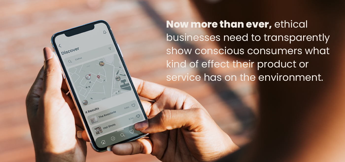
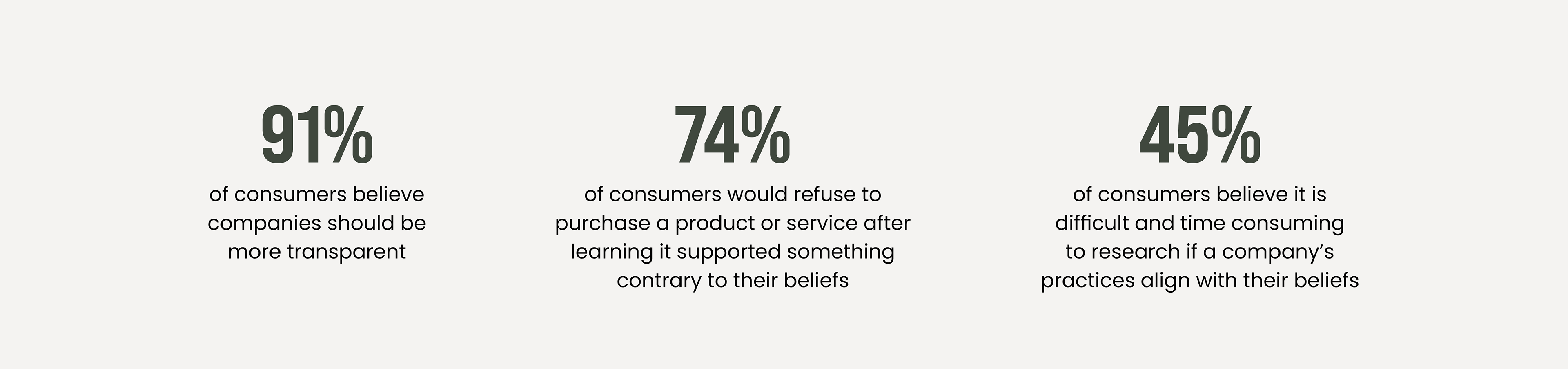
Conscious consumers want to shop in ways they believe makes a positive social, environmental or ethical impact. Finding businesses that align with their standards can be time consuming and lack of information can make it difficult to make purchasing decisions. If we can solve this problem, it will increase conscious consuming. We will do this by driving consumer traffic to businesses who uphold morally responsible practices.
THE OPPORTUNITY
Connect consumers to ethical businesses that align with their beliefs/goals, driving business, and protecting the world.
HOW MIGHT WE
Design an app that connects ethical, environmental and socially responsible businesses to conscious consumers.
PRODUCT DESIGN GOALS
1. User-centered experience design which matches users to businesses that align with their beliefs.
2. Encourage users to personalize their preferences for enhanced in-app experience.
3. Design recognition patterns with badge identification markers.
User Research
INTERVIEWS & SURVEYS
5 user interviews, one SME interview was conducted and 45 surveys were collected. All participants Identified as a conscious consumer or have an interesting in being a more conscious consumer. Participants range from Gen Z to Millennial.
AFFINITY MAP
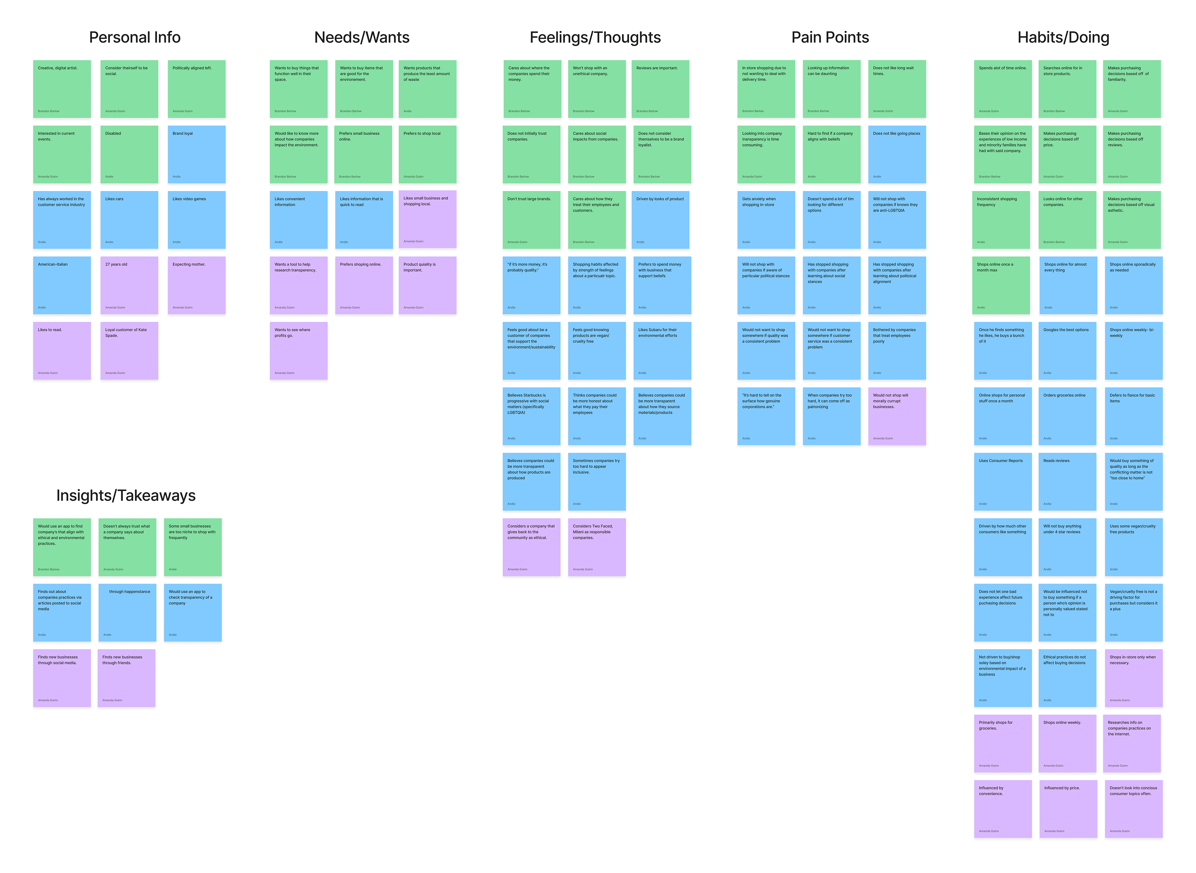
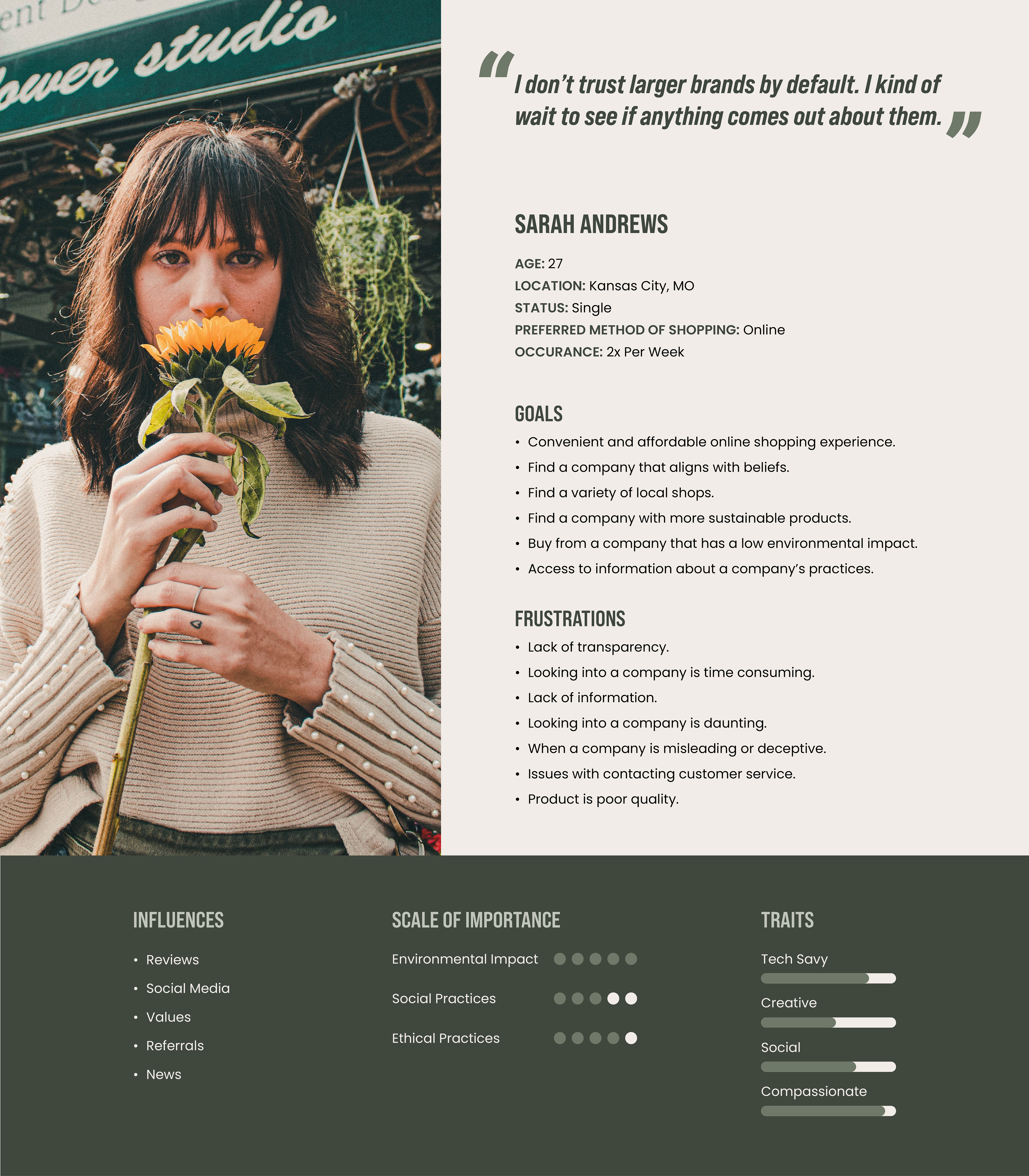
PERSONA
KEY INSIGHTS & TAKEAWAYS
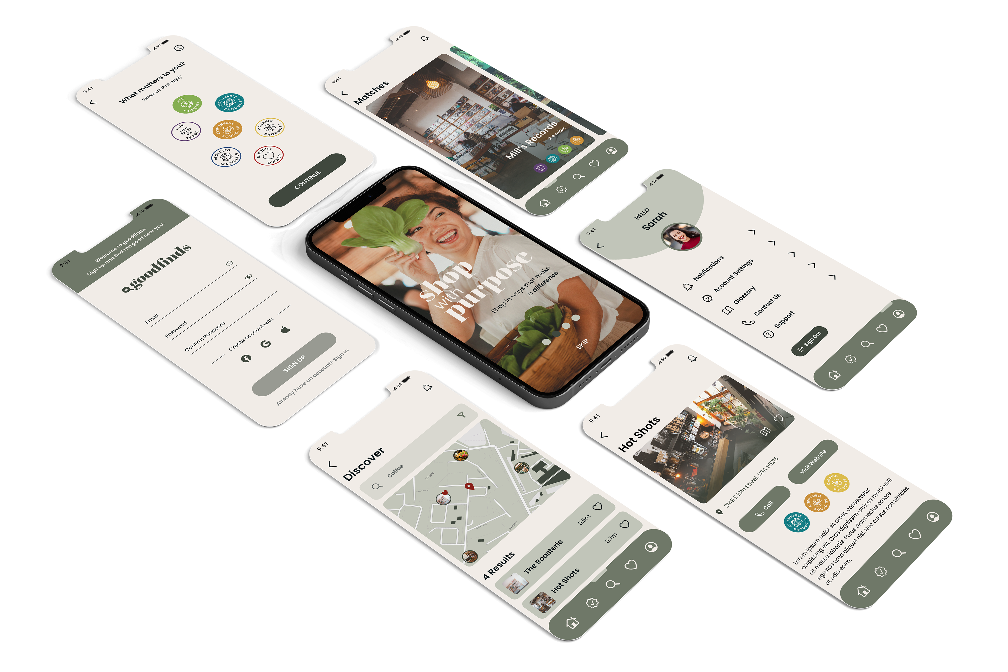
MOCK-UPS
MID-FIDELITY
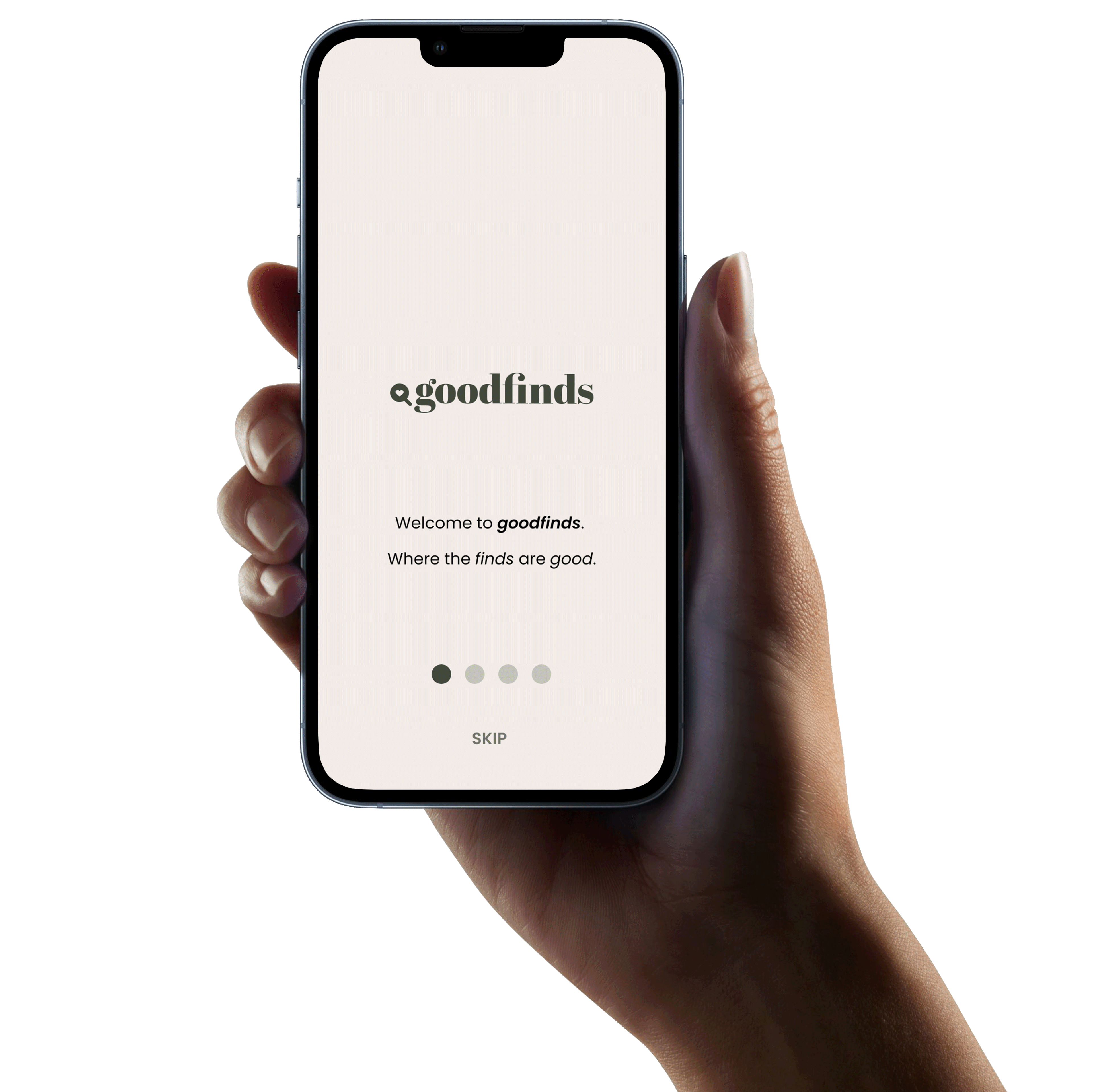
1. Intro carousel will only be seen upon downloading the app or in the instance of an update to the app.
2. At any point in the intro carousel you may skip to go straight to creating an account.
3. The app logo will go here.
4. Eye icon may be tapped to hide password. Symbol will change to an eye with a slash.
5. User will be able to upload a personal photo from their photo library or choose from pre-made avatars.
6. The user will be able to continue on the tags page with out selecting anything.
7. On this screen the icon will be animated to show the loading process.
8. Users will be able to select this button to favorite a store. Favorites can be accessed under the account page.
9. A filled heart will indicated the store has been favorited.
10. The map icon may be tapped to view a map with the location of the store.
11. Users will be offered alternative ways to sign-in, for example users may sign in with google.
12. This will be a carousel within the home page.
13. An icon in the navigation bar will be darkened to indicate which page the
user is on.
user is on.
14. Users will be able to edit the profile image by tapping the paintbrush icon.
15. Menu options will take
the user to various pages where they may edit their account, set preferences
and learn more.
the user to various pages where they may edit their account, set preferences
and learn more.
16. Upon tapping the sign out button, a pop-up will appear that allows the user to confirm they want to sign out.
17. When arriving to the Discover page, store closest to the users location will populate on the map and in the list of what is nearby.
18. This card will show the store name and distance of the store from the users location.
19. There are multiple ways to arrive to a store profile page. Users will be able to tap the back arrow from the store profile to return to the
previous page.
previous page.
20. By tapping the visit website button, users will be selecting
a link that takes them to a browser out of the app to view the store’s website.
a link that takes them to a browser out of the app to view the store’s website.
21. These will be the certification icons.
Usability Testing
The goals of the usability testing:
• Evaluate the decisions the user makes when presented with the intro carousel
• Testing the functionality of the sign up process
• How they feel about the process
• Validate the location of the favorites page
• Testing how the user chooses to login and navigate the app
How we tested the product’s usability:
• Gave user’s a series of tasks to complete
• Observed the user’s behaviors and responses to the prototype
• Asked user’s for additional feedback
Results
Positive Findings
• Users found the sign up and login pages familiar and easy to navigate.
• Most users favored the idea of using location services to better their in app experience.
• Users liked the purpose of the app and could imagine themselves using it.
Major Problems
• Users had a difficult time finding the favorites.
• Users were unfamiliar with several of the options to choose from under preferences.
Solution
• Move favorites to main nav menu.
• Develop unique identifying icons for preferences. Users will be able to learn about these categories and gain recall due to color coding these icons.
HIGH-FIDELITY
STYLE GUIDE
PROTOYPE
In CONCLUSION
Each phase from research to design was essential to create a user-centered design. As we progressed in this process we were able to use valuable insights and takeaways to guide us. We continued to iterate as we received feedback and gathered additional findings. And finally, we arrived to our prototype of GOODFINDS, an app that meets the needs of conscious consumers and ethical & socially responsible businesses alike. By using a system to match the user to businesses that align with their beliefs we are able to save the user time by cutting out the need to individually research, while also driving business to local businesses. In addition to solving this problem, GOODFINDS could also help to stimulate local economies and potentially have a ripple effect that would encourage large corporations to adopt more ethical and socially responsible practices.